Some time ago, Sonic Retro evilhamwizard found the graphics of what appeared to be a scrapped logo for Castle of Illusion (Mega Drive/Genesis), not referenced anywhere in the game code:
evilhamwizard
There are only two unused Nemesis archives in the entire ROM. The first is located at $49900, and appears to be "Mickey Mouse" in big multi colored text:The second at $4AD52 appears to be maybe some kind of mapping data (perhaps for this art)
This logo, far from being stored just as it would be shown on screen, has its graphics optimized to save space and reuses several of its tiles (groups of 8×8 pixels), sometimes logically and sometimes quite elaborately, all for saving a few bytes in the ROM (although the effort was somewhat useless, considering that they weren’t deleted after they were discarding).
Let’s try to reconstruct the mappings of these graphics to see how they were optimized.
Así quedarían almacenados en la memoria de video todos los tiles tras descomprimirlos (abajo he añadido el orden que tendrían sus desconocidos colores dentro la paleta):
This is how all those tiles would be stored in the video memory after being decompressed (added below is the order that their unknown colors would have inside the palette):
This would be the structure of the logo after placing all these graphics in place, always from left to right and from top to bottom:
As you can see, it seems that a few things are missing, but in reality we have everything necessary to form the complete logo in there.
First of all, we are going to fill in those holes in the M and the K, which are clones of the tile in the M that’s just to the left of the hole:
Now we can copy the whole piece that is missing from the second M:
Another letter that is repeated is the E, which also reuses part of its graphics (the K and S share a couple of shadow pixels):
Surprisingly, all the tiles that are missing in the top row come from the same part that protrudes from the K:
The missing part of the U comes from… the E!
Only the S remains to be completed. Where could the two missing tiles come from? Well, it is not necessary to go far, since that somewhat ambiguous curve of the U warns us that, to find the missing piece, we can take those two tiles to the left of the hole and mirror them:
And we already have the full logo!
Unfortunately, the game’s palettes seem to be compressed in the ROM, so I don’t know if their real colors are still present somewhere.
To see how it could have looked on the screen, I have applied a “golden” gradient similar to the final logo (and the Golden Axe 2 and 3):
Applying it to a mockup with the correct screen resolution, it would look somewhat like this:
Its width is 8 pixels smaller than the final logo, which allows it to be displayed on the screen well centered horizontally, with 3 empty tiles to each side.
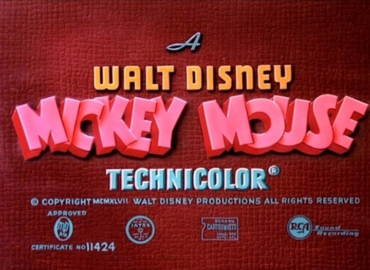
As a curious note, this logo is based on the title screens of the classic Mickey Mouse shorts, instead of the official logo which already existed back then, with pointed Ms and a more rounded U:
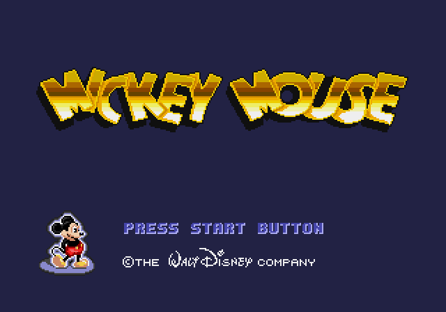
The final title screen, however, uses the logo seen on the Castle of Illusion box and the non-Japanese versions of World of Illusion, Land of Illusion and Legend of Illusion, which mixes elements of both (look at the Ms and the U):
This one also has similarities with the logos of Mickey Mousecapade, Mickey’s Dangerous Chase and Mickey Mania (and I suppose any other products in the franchise with any more text than “Mickey Mouse”), so these were surely created with the same official typography procured by Disney: